October 19, 2017

Data Visualization 101: How, What, Why?

By Cloud Syndicate

Data Visualization 101 
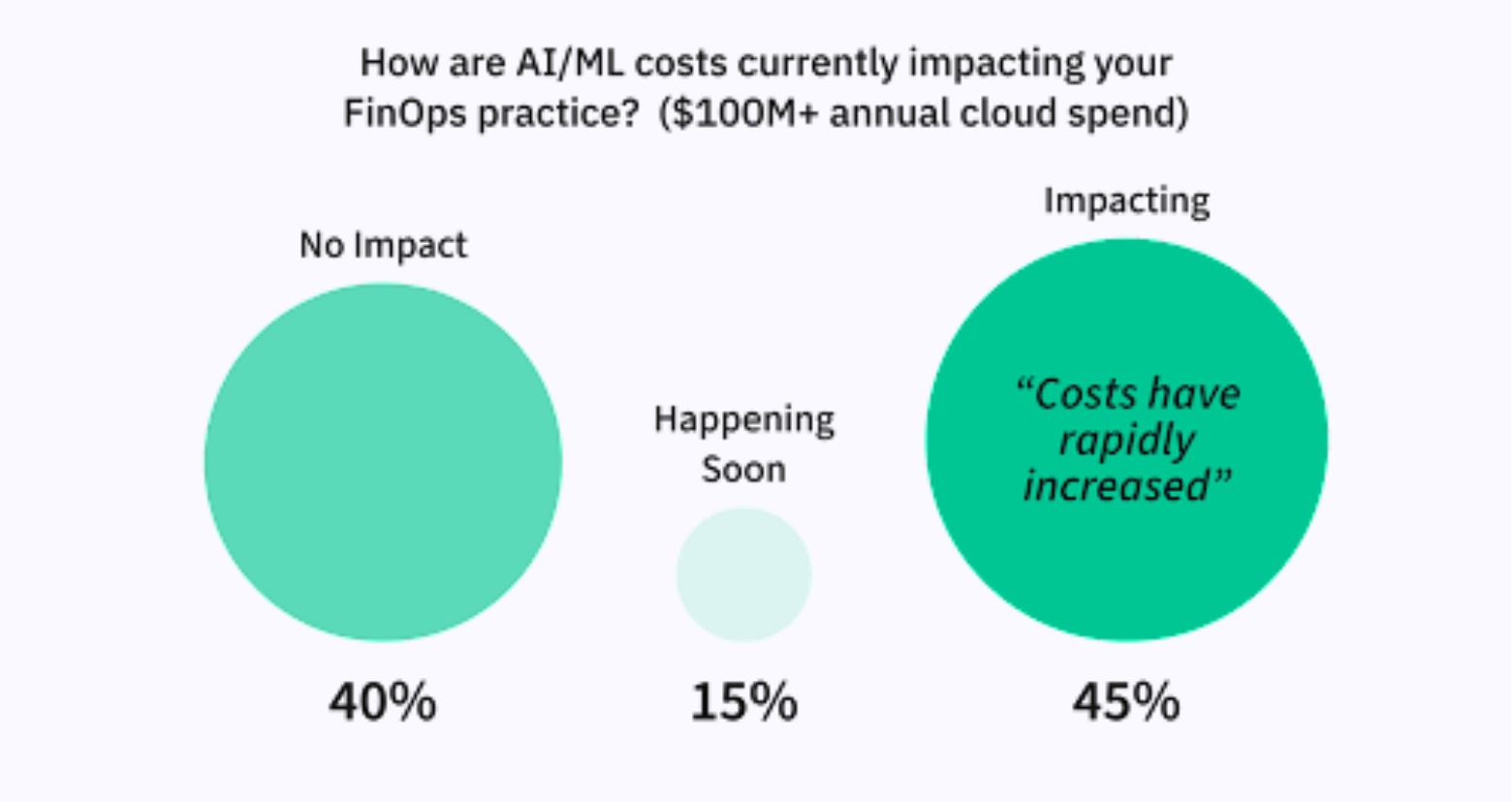
“A picture is worth a thousand words.” This old, English idiom could not ring more true than in today’s fast-paced, digital age – the big data age. At a time when we are creating 2.5 quintillion bytes (or 2.5 million terabytes) of data each day, executives and decision-makers across the globe are […]

Data Visualization 101

A picture is worth a thousand words.” This old, English idiom could not ring more true than in today’s fast-paced, digital age – the big data age. At a time when we are creating 2.5 quintillion bytes (or 2.5 million terabytes) of data each day, executives and decision-makers across the globe are looking for ways to turn complex and voluminous data into comprehendible and comprehensive, actionable insights. Enter, data visualization.

What is Data Visualization?

The visualization of data for purposes of analysis is not a new concept. Finding their roots in Descartes’ Cartesian coordinate system, several graphical diagrams such as the line, area and bar chart were invented in the late 18th century by Scottish engineer and political economist, William Playfair. He was also the inventor of the once widely-popular, yet more recently denounced, pie chart.

Data Visualization sits atop the Big Data Analytics pyramid (Figure 1) and is often the only layer that is visible to executives and other decision-makers. Thus, the success or failure of a Big Data analytics program often depends on the success of the visualization layer. A company may have the most advanced data capture, storage, and transformation technology (and use the most complex algorithms and statistical models to analyze that data), but if the information isn’t displayed clearly, accurately and efficiently, the whole point of leveraging Big Data is lost.

(Figure 1 – Big Data Analytics Pyramid)

Why Data Visualization? What are the benefits?

It is often said that data is the new world currency. But let’s face it, raw data is boring and difficult to make sense of it in its natural form. Because of the way the human brain processes information, using charts or graphs to visualize large amounts of complex data is easier than poring over spreadsheets or reports. According to the Visual Teaching Alliance, studies show that 90% of information transmitted to the brain is visual, visuals are processed 60,000 times faster in the brain than text, and our eyes can register 36,000 visual messages per hour. It’s a no-brainer that visuals work better than text.

All types of organizations are using data visualization to help make sense of their data and to comprehend information quickly. Data visualization is a quick, easy way to convey concepts in a universal manner, and due to advances in data visualization technologies, you can experiment with different scenarios by making slight adjustments to available data filters – This is called visual analytics. Visual analytics allows users to directly interact with data, visualize relationships and patterns between operational and marketing activities, gain insight, draw conclusions and make better decisions, quicker. The visibility and clarity delivered by such digital technologies and advanced analytics can give executives unprecedented, granular views into operations. Additionally, it may increase agility and support better strategic decision making by showing the reasons why certain recommendations make the most sense. This can have a significant impact on how businesses gain insight from their data.

Data visualization ultimately aims to provide perspective, reveal trends, provide context and tell a story. Most importantly, data visualization should empower users to harness, in a meaningful way, the power of Big Data.

How to tell a story with Data Visualization?

One of the cardinal sins of a business presentation is for good data to be presented badly. How so? If data is misrepresented or presented ineffectively, key insights and understanding are lost, which hurts both the overall message and the reputation of the person or team delivering the message. Knowing your data and knowing how to best present it, are two ways of getting data visualization right.

Data comes in different types. The most common are:

  • Quantitative: information that can be measured and written down in numbers. For example, the outside temperature or the number of employees in an office.
  • Qualitative: information about qualities that cannot be measured. For example, the color of a briefcase. Most business problems deal with quantitative data. Purely qualitative data is very difficult to analyze due to the absence of numbers. However, qualitative data is powerful when used in a categorical context.
  • Categorical: information that can be organized into mutually exclusive categories. For example, six managers are from Asia, five from Africa, two from Australia, and nine from the Americas. In this case, categories are the regions in which the managers are located.
  • Geospatial: information that has a geographic component (in the form of coordinates, address, city, or ZIP code) to it. For example, locations of sales offices or well drilling sites.

Selecting the right type of data visualization involves understanding the underlying data and more importantly, the story you are trying to tell. There are four main presentation types that will aid you in telling your story:

  • Comparison: used to compare magnitudes of values among items, over time or both – For example, sales from different regions or sales of a particular region over time. Bar charts and table charts typically work best for comparisons among items, and line graphs and bar charts for comparisons over time.
    • Geographic Comparison: used to compare used to compare magnitudes of values among items, but displayed as a map. For example, the number of Fortune 500 companies by city within the United States.
  • Composition: used to compare part to whole relationships that are either static or compared over time. For example, percentage of online sales compared to other channels for a single period or over a number of periods. The pie chart has been a favorite for presenting static composition, however many experts agree that it is only best used when showing popular fractions (1/2, 1/3, 1/4). A Treemap or stacked bar chart may work much better. Stacked bar charts also convey composition information over time well.
  • Distribution: used to show how quantitative values are distributed over an axis (from lowest to highest) or into pre-defined categories. For example, number of customers per age group, further classified by income level group (second variable). A bar histogram or line histogram may work well for single-variable data, while a scatter plot and 3D area chart can work well for two and three-variable data, respectively.
  • Relationship: used to show the relationship between different data points of an item. Aggregating the relationship over multiple items reveals trends, correlations, clusters and outliers. For example, the correlation between marketing spend and product sales. Scatter plots and bubble-charts work best for two and three-variable data, respectively.

Data visualization is as much an art as it is science and numbers. In addition to using the right chart type to tell your story, you can also play with levers such as color, size, scale, shapes and labels to direct attention to the key messages of your story. The most important aspect, however, is getting the “story” right; ensuring that the right data is appropriately visualized for the audience that will consume it. Data visualization technology too, is constantly evolving. From automatically recognizing types of data to making recommendations about the best chart type to use, advances in data visualization technologies have made creating stunning visualizations a matter of a few clicks. More, the emergence and mainstreaming of virtual reality has given data visualization a new dimension, allowing for visualization concepts and techniques that have hitherto been restricted to futuristic sci-fi movies and TV shows. The future of data visualization is bright, and it will be exciting to see what advances and discoveries are made in the next few years.

By Karan Passey, Manager, Data & Analytics Enaxis Consulting

Cloud Syndicate

Welcome to the 'Cloud Syndicate,' a curated community featuring short-term guest contributors, curated resources, and syndication partners covering diverse technology topics. Connect your technology article or news feed to our syndication network for broader visibility. Explore the intersections of cloud computing, Big Data, and AI through insightful articles and engaging podcasts. Stay ahead in the dynamic world of technology with our platform for thought leadership and industry news.

Join us as we delve into the latest trends and innovations.
Jeff DeVerter

Charting the Course: An Interview with Rackspace’s Jeff DeVerter on AI and Cloud Innovation

Rackspace’s Jeff DeVerter on AI & Cloud Innovation In an insightful conversation with CloudTweaks, Jeff [...]
Read more
Steve Prentice

Episode 19: Why AWS Needs to Become Opinionated about FinOps

On today’s episode of the CloudTweaks podcast, Steve Prentice chats with Rahul Subramaniam, CEO at CloudFix [...]
Read more
Steve Prentice

Get Smarter – The Era of Microlearning 

The Era of Microlearning Becoming employable and then staying employable requires ongoing, up to date [...]
Read more
Metasploit-Penetration-Testing-Software-Pen-Testing-Security

Leading Cloud Vulnerability Scanners

Vulnerability Scanners Cyber security vulnerabilities are a constant nuisance and it certainly doesn’t help with [...]
Read more

Exploring SaaS Directories: The Path to Optimal Software Selection

Exploring the Landscape of SaaS Directories SaaS directories are vital in today’s digital age, serving [...]
Read more

Azure Free Tier vs. AWS Free Tier: Which Provides More Value?

Cloud computing has become a cornerstone for the digital transformation of businesses. From startups to [...]
Read more

SPONSORS

SPONSOR PARTNER

Explore top-tier education with exclusive savings on online courses from MIT, Oxford, and Harvard through our e-learning sponsor. Elevate your career with world-class knowledge. Start now!
© 2024 CloudTweaks. All rights reserved.